Sustainability Asset Mapping
2023
Charley Allen's Capstone project was developed as a part of his internship with the City of Albuquerque Sustainability Department.

Under the direction and guidance of Sandra West, he created a resource map of composting facilities in the city. The process began with identifying stakeholders and potential participants, then progressed to the drafting, revision, and distribution of emails to said individuals and organizations. They were sent a link to a Google Form he created to collect relevant data for the map, such as location, public access information, contact points, security concerns, and volunteer opportunities. After the end of a fixed time period for collection, Charley aggregated this data into the ESRI ArcMap mapping program, creating point features and logging and structuring data manually. Once this feature layer package was created, the next task was to upload it to Sandra’s ESRI account and convert it to Web Map format. This proved tricky and required a lot of troubleshooting as ESRI’s software is notoriously buggy, but eventually he found a solution in publishing the data from his account, then downloading it into the city’s account from the web platform. He stylized the features for ease of interpretation in web format, then the final step was to create a self-reporting survey through ESRI’s Survey123 tool which included the same questionnaire from the initial Google Form. This survey should be housed alongside the web map and ensure longevity and dynamic updating by allowing any developing or previously omitted organizations to join the map. My portion of this task is now completed, and the department should be publishing the map and survey to their Climate Action resource page soon.
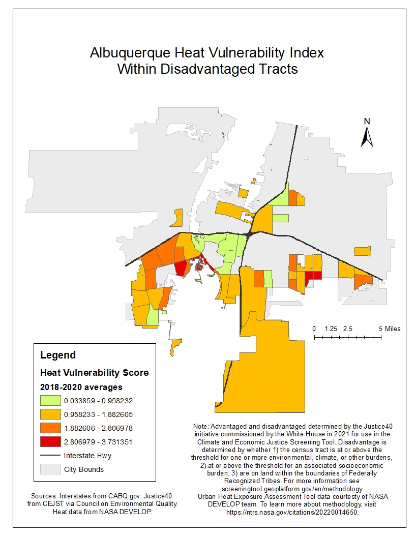
The second task of Charley's internship and project was guided by Denise Castillo in the same department. She requested a heat map of aggregate summer temperature extremes in the city overlayed with disadvantage status as determined by the federal Justice 40 Initiative. She put me in contact with Lauren Childs-Gleason of the NASA DEVELOP team, which conducted social and biophysical research in Albuquerque for development of the Urban Heat Exposure Assessment Tool. Lauren shared the team’s data from this project with me, but it became clear that the metadata of this project was corrupted and the files inaccessible. He sought help from the Earth Data Analysis Center on campus, who were unable to recover the data, then reached out to other city employees, organizations, and NASA team members with access to this package to request alternative copies of the records, but all were likewise corrupt. At this point Denise, Sandra and Charley decided to shift focus and utilize the one aspect of the data which was accessible: the heat vulnerability scores, which were derived by NASA from a series of social, economic, and physical variables of risk. He hit another road block when attempting to average the data across the three years of study (2018, 2019, 2020), and sought help from a grad student in his department, who helped him discover that the census tract boundaries had been changed with the 2020 census, resulting in incompatible polygons in the data. We performed a merge function to adjust the data to the current reality, a join function to aggregate the data across the time period, then a statistical analysis to create a new data field of averages. From this point, he created a set of four maps – the first identifying which tracts were disadvantaged according to the Justice 40 assessment, the second displaying heat vulnerability of tracts on a graduated color ramp, the third eliminating any heat vulnerable tracts scoring below zero (ie not vulnerable) and overlaying disadvantaged tracts to identify overlap, and the fourth isolating only the tracts which met both criteria and ranking them by severity of heat vulnerability. The result of this study was that the most at-risk tracts were in the International District and the South Valley. The final step of this process was to format the maps with elements like legends, scales, etc. and to thoughtfully construct descriptions which explained the details of what “disadvantaged” means and the methodology of the organizations we acquired the source data from. Maria Lane once told him, “there’s no such thing as an unbiased map”, and he wanted to deeply consider and hold space for the reality that he, a white person, guided by another white person in office, was making maps based off of research done by white people outside of the community, in order to tell predominantly Native and Hispanic communities that they were experiencing disadvantages. This series of maps will be used in the next legislative session to guide decision making of where to allocate federal grant funds for retrofitting and implementing cooling stations to communities most in need in the city, and Charley hopes that it can manifest real and direct benefits to people’s lives and safety. He learned a lot about data management, professional correspondence, and the capabilities of ESRI software from this project, and he's grateful to have had this opportunity.
